Address Hotels : Attractions Booking Journey
Address Hotels + Resorts is a premium luxury hotel group by the Emaar Hospitality Group based in the UAE and the nearby regions. Quite a few of the hotels in the chain are reputed as one of the best hotels in the world. Our job was to create a user booking journey for the guests staying in, to experience various attractions that were available to them.
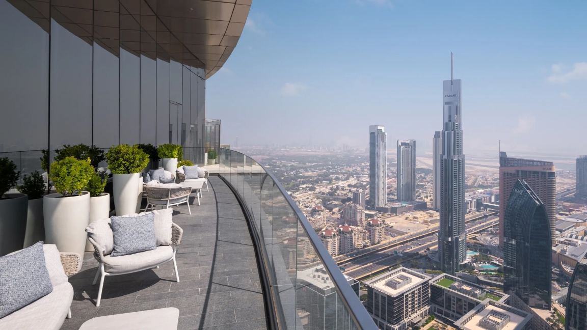
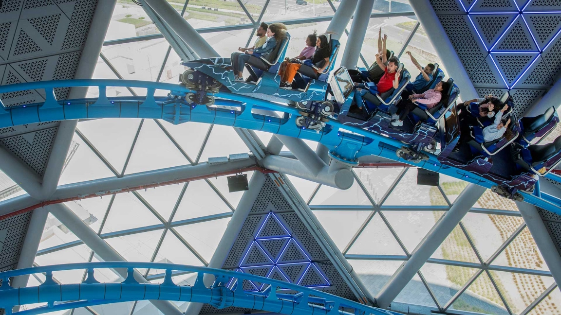
Overview: Creating a booking journey for the guests staying in address hotels to the various rides and attractions available at the hotel. Guests can pre-book their spots and get the access for the attractions once they have confirmed their stay at the hotel.
Duration: March '21 to May 21'
Role & Responsibilty: As the sole frontend developer, designer for the project, my main tasks were to craft and design the frontend UI flow of the user journey for booking of the attraction tickets, keeping in mind the strict emaar design guidelines and interactions that go with address hotels, all the while taking constant feedback from the PM and the senior designer.
Step 1: The Attractions Landing Page
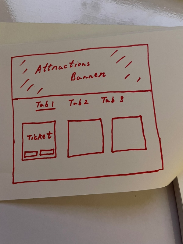
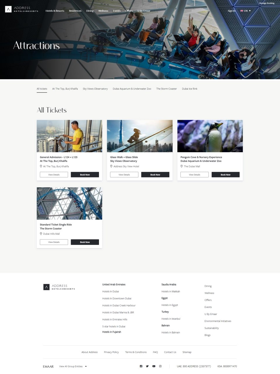
This is first step in the user journey, the attractions landing page. Here, we list down all the attractions tickets that the guests can choose from. Hence, we have used a cards to represent each ticket layed out in the form of a grid.
- A banner section was added to the top of the page to signify the attractions landing page.
- Single ticket was represented in the form of a card consisting of two CTAs, one for the Book Now option and the other for View Details to give the user further information about that particular attraction/ticket
- Cards will be categorized into tabs based on the location of the attraction.
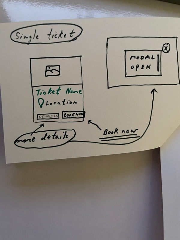
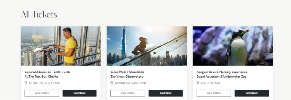
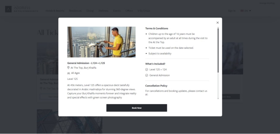
Layout was implemented using the bootstrap column grid, the buttons
were created by customizing the already exisiting .btn and .btn-primary
classes in the library by adjusting properties like padding, color and
background-color.
While we had a button popup modal pre-existing in the package but I
preferred to make a custom vanilla javascript popup for the ease
of customization according to our design and to allow future scope of change
if required by the client.
Step 2: Select date, time and number of guests
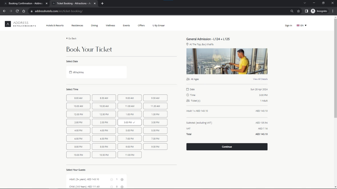
Once the guest had selected his preferred attraction, the second step involved picking the date, time and the no. of people that would come to see the attraction (prices are different for adults and children)
Therefore, the overall layout was divided into 3 sections:
-
Select Date
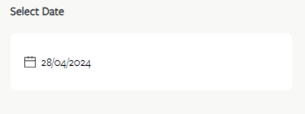
( On click here, opened a date picker library ) - Select Time

( Based on the date selected an API call is made to fetch all the timinigs available for that particular date in the database. Select state is depicted by adding a svg icon in the button ) -
Select Your Guests
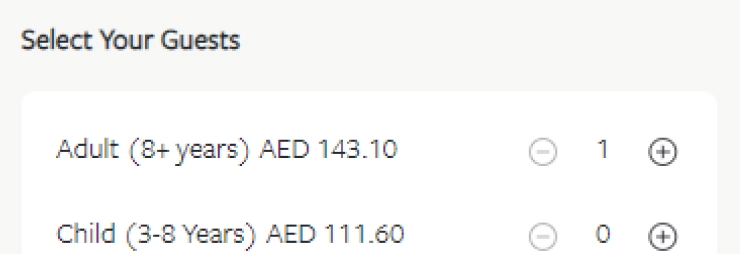
*All options chosen by the user are updated in the right hand column, allowing the user to review his choices along with the total price before heading to checkout.
Step 3: Checkout / Confirm your booking
For the final checkout page, the client and our design team concluded it was in the best to make the layout identical to the checkout page of the address hotel room booking, therefore maintaining uniformity.
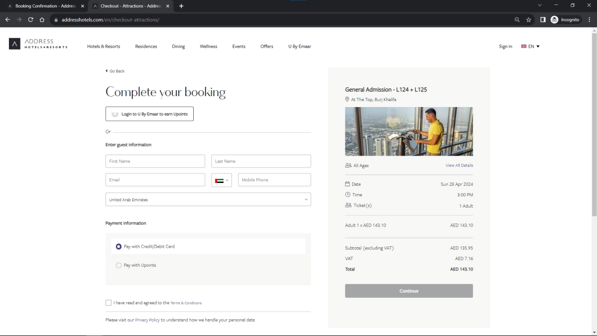
*Here an option is provided for U by Emaar payments that is loyalty points based system by emaar.
Upon completion, you recieve your tickets in your mail and they get attached to your hotel room booking
My Learnings
To be honest, this project really highlighted the importance of soft skills that we often mention in our resume. Although techincally from a design an UI perspective, it was moderately challenging in my option (my backend developer colleague would disagree) but following a close client timeline with recurring changes in the development schedule, communication became a key in acheiving the required outcome
- For example, in this project the role of the backend developer was very critical, after the layout and the UI were ready from my side, the fetching and integrations of the different booking APIs needed to be implemented. For this the backend developer had to work on my codebase to align my frontend code with his server side logic. So, right from the get go, we were in constant touch with each other, planning and executing our tasks in tandem, each with a clear idea of what is actually going on in the process.
- This was a booking journey, so user-testing became very essential here, mutliple personas and scenarios had to created here to avoid any kind of error while the user was booking the attraction tickets. Also, error screens had to created to let the user know of any server side error. The client side testing was treacherous, going back and forth for hours literally. But that is required when you're handling such an important bussiness requirement.
- Besides this aspect, form validation was one of the key highlights from this project. The checkout form had to be checked for mutliple edge cases/conditions in the frontend. Even in the design, certain properties like the font-size of the input field had to be carefully set (if input field font-size is less than 16px, the form zooms in mobile view, causing the cropping of the whole form, thus forcing the user to touch scroll to navigate other fields )